Tuesday, April 30, 2013
Hollowing Out A Book
This Page among others helped me so much with my project that I felt the need to share it. Tired of those pesky books clogging your shelves? Need a place to conceal your stuff, or perhaps make some creative paper art? Then this is the project to use! I personally like how this webpage's examples are a bit more playful in carving around pictures. So whenever you feel like it, try it out. I personally loved doing it for my project, it made my parents' old books so much more interesting.
For the person who has everything....
I really think this is a silly packaging idea: Medea Spirits has an interactive LCD display bottle. I guess they might have thought this is the kind of gift you might get someone who needs nothing else? Since most people have smart phones that play videos and store photos, this seems kind of excessive to me. The release date and price are still TBD. I wonder how much this will cost?

Wednesday, April 24, 2013
Cardboard High


Makoto Orisaki made a special cutting tool to cut cardboard in more sustainable and eventful ways for packaging. The simplicity of the cutting tool, "or-ita", makes the act of folding cardboard as familiar as the act of folding paper. This tool is a great source for packaging with the new expressions that become possible with the use of or-ita; so called cardboard furniture and products could be benefited from or-ita.
Tuesday, April 23, 2013
Student Works
With the end of the year drawing nigh, I felt a bit nostalgic looking back at all of our packaging projects, seeing our skills change and adapt. So I wondered what other packaging students came up with at other art schools, and looked up some student work. Here is a list on Lovely Package with works that packaging students have done. I gotta say I admire the craftsmanship on many of them, especially the wine bottles and any other packaging that begs for sophistication.
So here's to the end of the year, when all of OUR class works will finally pay off ... and we won't have to see them ever again.
So here's to the end of the year, when all of OUR class works will finally pay off ... and we won't have to see them ever again.
The Future is Here: Edible Packaging
In 2010 Americans threw away over 75 million tons of packaging waste. Ugh. Some Harvard scientists came up with a (possible) solution: what if packaging was edible? This video from Bob's Burgers in Brazil talks shows people eating their edible burger wrappers. I was wondering if this was a joke when I first watched it... what could edible wrappers possibly taste like?
This is the Huffington Post article with more info.


This is the Huffington Post article with more info.


Monday, April 22, 2013
also, this isn't packaging but I wanted to share because its.... AWESOME
http://www.behance.net/gallery/Sponsored-Heroes/7322335

http://www.behance.net/gallery/Sponsored-Heroes/7322335

We have talked a lot about how our packages inpack our environment and how to minimize that impact but we havent talked much about how a package can give back to the community other then the ability to be composted. This company Depaul Box Co suports and helps homeless young people whenever you buy there product, which there product essentially is packaging and not a real product. I like how they used the iconography of existing packaging to advertise there cause and turn there package into a moving advertisement that my stay in a persons home for years, be it in a grage or attic some where.

Wednesday, April 17, 2013
Anti-Anti Packaging Ad: Packaging is not JUST about having too much!
In response to a French environmental group making a commercial about over packaging, the French packaging company Elipso made a video about why they think packaging is important. Elipso's video imagines a world without packaging, where you carry meat on your arm. It's pretty silly, and I feel like Elipso may have taken the environmental commercial a little too seriously.
Read the article and compare the commercials here.
Read the article and compare the commercials here.
Here is a blog of some one doing a similar class to ours and shows there steps and thought process from how they do market research to how they update or change the package.
http://blondenine.wordpress.com/category/uncategorized/page/2/

http://blondenine.wordpress.com/category/uncategorized/page/2/
this is a good image to show how they layout information in there project boards in much the same way we do for our class.
Illustrative Comfort Packaging Box

These are handmade 3D illustrations in small pocket size boxes. The boxes include comforting words like: 'everything with be ok', 'you look wonderful today', 'you can do it!'. Kim Welling created these nifty designs, ideas, and illustrations. I considered these to be some what relative to the packages of ideas we are doing for our projects now. The out side slip box has great hand written font design. However, the craft not being the best, I think it works well with this idea and the way she went about creating it in a three dimensional manner.
Wednesday, April 10, 2013
Canned Goods
Design of universal form based from the idea of immaterial needs that we, individuals change of mindset and is about "next generation luxury". FLOWmarket was designed by Mads Hagstrom. I found this packaging interesting from the basic black and white and very simple design to be very appealing. I can see how this package stands as a design, art, and business or activism, in which how some journalist would label it. This reminds me of a rock or a luck coin in which someone keeps in their pocket or purse, but instead reinterpreted through the art of packaging design.


Tuesday, April 9, 2013
HLP Klearford Clear Packaging
HLP Klearford is a packaging company solely focused on producing clear packaging. I have to admit, there is a sophisticated and smooth look to clear packaging that is just so appealing. They do everything from baby lotion to alcohol, and it all has a special way to utilize the clear packaging. I especially love how some of the plastic boxes utilize the dimensions of the box to make the graphics look 3D. Do you see that fish? That's one cool fish!
Perhaps for my box design with windows, I can insert a little surprise such as those 3D graphics underneath the jewelry to make the packaging more dynamic. Too much?


Perhaps for my box design with windows, I can insert a little surprise such as those 3D graphics underneath the jewelry to make the packaging more dynamic. Too much?

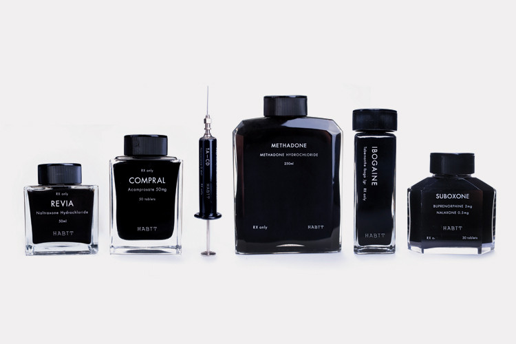
http://www.fastcodesign.com/1665858/why-not-heres-luxury-packaging-designed-for-rehab-drugs#1
Here is a short article about Luxury packaging designed for rehab drugs. They are amazingly simple and beautiful and make me want to buy them regardless of what the liquid inside is for! In the article they talk about the glamorization of drug use and celebrity status that rehab has played a role in. This packaging compliments that glamorization and makes you want it.. maybe more then the drugs?....

Here is a short article about Luxury packaging designed for rehab drugs. They are amazingly simple and beautiful and make me want to buy them regardless of what the liquid inside is for! In the article they talk about the glamorization of drug use and celebrity status that rehab has played a role in. This packaging compliments that glamorization and makes you want it.. maybe more then the drugs?....
C.T. Lockart Whiskey
I thought of the book packaging for Brittany's project we were talking about last week in class when I came across this project. Trevor G. Rogers used a hollowed out book to package a flask of whiskey for C.T. Lockart limited edition whiskey. Hiding a limited edition within a book makes sense and puts another layer on the well known idea of hiding flasks in hollowed out books. Plus, I love how the text on the packaging says the product is "top secret" and "behind closed door." The fact that this is a "History of Prohibition" book makes this project funny, clever, and adds more layers of meaning to the idea of using a book for this product.


Wednesday, April 3, 2013
Cyber Graphics!
We have a field trip scheduled for the morning of Wednesday, April 17. The field trip will be at Cyber Graphics here in Memphis. The focus primarily on flexible packaging.
Prior to our visit, please familiarize yourself with their website.
The address is 3825 Delp Street
Memphis, TN 38118
More information to follow.
Prior to our visit, please familiarize yourself with their website.
The address is 3825 Delp Street
Memphis, TN 38118
More information to follow.
Kael Little on Behance
Kael Little on Behance
Kael Little is a midwest designer/illustrator who creates an interesting link between illustration and design. Not all of his work is package design however the few I did find were very comical and eye catching.
I found the chocolate boxes first and would have loved to have woken up to them Easter morning. The other works are scattered among his page but worth the find!


Farrow
I found Farrow, a design agency in London, while browsing for inspiration for our experimental project. The image that drew me to their website initially was the package design for Harvey Nichols (bottom image). I love the colorful candy-like pills spilling across the box evoke a sense of the beauty products being "healthy" but also young and playful. When I went to their website I came across this simple sleeve for the Pet Shop Boys CD. I like the way the flowers in the cutout become the figure while it is packaged, but reveal the full image when it is opened.


Tuesday, April 2, 2013
The Fun Theory
A tad dated, yes, but I still think this is such a great idea and something every product and packaging designer should think about!
The Fun Theory was formed by Volkswagen with a simple idea -- That people are more willing to do something if the task is made fun! By applying creative thinking to issues like how to get people the recycle or exercise more or obey the speed limit, they can turn the task into a funny and exciting experience. It made me think of the surprise-and-delight features of packaging, as well as how awesomely this re-enforces sustainable thinking in that it improves the lives of people and products. Think of the possibilities that could emerge if everyone had this theory in the back of their minds.
Check them out!
http://www.designresourcebox.com/examples-of-package-design-made-of-wood/
This blog show a lot of really awesome wooden packaging designs! my favorite out of the bunch is the blackbox case, it is so simple and elegant it becomes something you always keep with the product and is what the product becomes know for. Also this would make amazing leave behinds for portfolio reviews.
 The strangest one on the blog is the toothbrush shower holder, Its an example of reusable packaging but seems so weird sitting in the shower!

This blog show a lot of really awesome wooden packaging designs! my favorite out of the bunch is the blackbox case, it is so simple and elegant it becomes something you always keep with the product and is what the product becomes know for. Also this would make amazing leave behinds for portfolio reviews.
Subscribe to:
Comments (Atom)