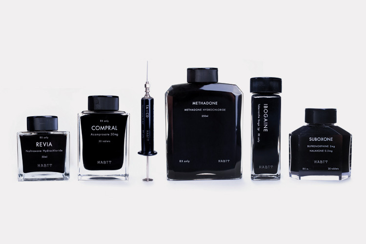
http://www.fastcodesign.com/1665858/why-not-heres-luxury-packaging-designed-for-rehab-drugs#1
Here is a short article about Luxury packaging designed for rehab drugs. They are amazingly simple and beautiful and make me want to buy them regardless of what the liquid inside is for! In the article they talk about the glamorization of drug use and celebrity status that rehab has played a role in. This packaging compliments that glamorization and makes you want it.. maybe more then the drugs?....
Tuesday, April 9, 2013
C.T. Lockart Whiskey
I thought of the book packaging for Brittany's project we were talking about last week in class when I came across this project. Trevor G. Rogers used a hollowed out book to package a flask of whiskey for C.T. Lockart limited edition whiskey. Hiding a limited edition within a book makes sense and puts another layer on the well known idea of hiding flasks in hollowed out books. Plus, I love how the text on the packaging says the product is "top secret" and "behind closed door." The fact that this is a "History of Prohibition" book makes this project funny, clever, and adds more layers of meaning to the idea of using a book for this product.
Wednesday, April 3, 2013
Cyber Graphics!
We have a field trip scheduled for the morning of Wednesday, April 17. The field trip will be at Cyber Graphics here in Memphis. The focus primarily on flexible packaging.
Prior to our visit, please familiarize yourself with their website.
The address is 3825 Delp Street
Memphis, TN 38118
More information to follow.
Prior to our visit, please familiarize yourself with their website.
The address is 3825 Delp Street
Memphis, TN 38118
More information to follow.
Kael Little on Behance
Kael Little is a midwest designer/illustrator who creates an interesting link between illustration and design. Not all of his work is package design however the few I did find were very comical and eye catching.
I found the chocolate boxes first and would have loved to have woken up to them Easter morning. The other works are scattered among his page but worth the find!
Kael Little is a midwest designer/illustrator who creates an interesting link between illustration and design. Not all of his work is package design however the few I did find were very comical and eye catching.
I found the chocolate boxes first and would have loved to have woken up to them Easter morning. The other works are scattered among his page but worth the find!
Farrow
I found Farrow, a design agency in London, while browsing for inspiration for our experimental project. The image that drew me to their website initially was the package design for Harvey Nichols (bottom image). I love the colorful candy-like pills spilling across the box evoke a sense of the beauty products being "healthy" but also young and playful. When I went to their website I came across this simple sleeve for the Pet Shop Boys CD. I like the way the flowers in the cutout become the figure while it is packaged, but reveal the full image when it is opened.
Tuesday, April 2, 2013
The Fun Theory
A tad dated, yes, but I still think this is such a great idea and something every product and packaging designer should think about!
The Fun Theory was formed by Volkswagen with a simple idea -- That people are more willing to do something if the task is made fun! By applying creative thinking to issues like how to get people the recycle or exercise more or obey the speed limit, they can turn the task into a funny and exciting experience. It made me think of the surprise-and-delight features of packaging, as well as how awesomely this re-enforces sustainable thinking in that it improves the lives of people and products. Think of the possibilities that could emerge if everyone had this theory in the back of their minds.
Check them out!
The Fun Theory was formed by Volkswagen with a simple idea -- That people are more willing to do something if the task is made fun! By applying creative thinking to issues like how to get people the recycle or exercise more or obey the speed limit, they can turn the task into a funny and exciting experience. It made me think of the surprise-and-delight features of packaging, as well as how awesomely this re-enforces sustainable thinking in that it improves the lives of people and products. Think of the possibilities that could emerge if everyone had this theory in the back of their minds.
Check them out!
http://www.designresourcebox.com/examples-of-package-design-made-of-wood/
This blog show a lot of really awesome wooden packaging designs! my favorite out of the bunch is the blackbox case, it is so simple and elegant it becomes something you always keep with the product and is what the product becomes know for. Also this would make amazing leave behinds for portfolio reviews.
The strangest one on the blog is the toothbrush shower holder, Its an example of reusable packaging but seems so weird sitting in the shower!
This blog show a lot of really awesome wooden packaging designs! my favorite out of the bunch is the blackbox case, it is so simple and elegant it becomes something you always keep with the product and is what the product becomes know for. Also this would make amazing leave behinds for portfolio reviews.
The strangest one on the blog is the toothbrush shower holder, Its an example of reusable packaging but seems so weird sitting in the shower!
Subscribe to:
Posts (Atom)


