http://www.flickr.com/photos/thoughtstudio/
real nice packing design work also artwork.
Wednesday, February 27, 2013
Office
Office - 826 Valencia Article
While doing research for this assignment I came across this company, at first I thought they produced "office supplies" but I quickly found out otherwise. This particular article is about a San Francisco company called 826 Valencia. I love the "pirate" theme everything seems to have. And how it isn't to over the top with that direction.It even goes as far as to have pirate sayings as if pirates them selves would be purchasing the items.

While doing research for this assignment I came across this company, at first I thought they produced "office supplies" but I quickly found out otherwise. This particular article is about a San Francisco company called 826 Valencia. I love the "pirate" theme everything seems to have. And how it isn't to over the top with that direction.It even goes as far as to have pirate sayings as if pirates them selves would be purchasing the items.

Petrocoll Pinup Putty Bags
I found mousegraphics, a Greek design agency while browsing Lovely Package. They have some really interesting package design, and the project that caught my attention the most was pinups on bags of plaster. It is a funny idea since the target audience is, according to traditional roles, men doing construction and repair jobs. I find gendered packing fascinating, and while I have mixed, mostly negative feelings about the undertones of this package, it is definitely worth checking out. Can you imagine seeing this at Home Depot?


Tuesday, February 26, 2013
Packaging Blog
Here is a blog I found when researching for mood boards. This blog provides examples of templets along with the layout copy of templets. There are all different kinds and lists of the resources where the designed templates are taken from. Make sure to click on the category links listed on the side to view other assess to this blog and packaging examples and templates.
Research Packaging Blog
Research Packaging Blog
Thursday, February 21, 2013
CMYK playing cards
I found this link via TheDieline, and thought it was pretty cool! This designer stripped basically everything anyone knows about traditional playing cards, and made them into a CMYK edition. Instead of hearts, diamonds, clubs, and spades, they are Cyan, Magenta, Yellow, and Key. Just take a quick look! It's so clever!


http://hundredmillion.co.uk/HM-cmykcards.html


http://hundredmillion.co.uk/HM-cmykcards.html
Wednesday, February 20, 2013
I though this article was crazy http://shopping.yahoo.com/news/designing-the-packaging-free-future-212537958.html It talks about using washable inks and other metheds to element packing. I think however that it is nieve to think that this will work across all products and will even be used, because when the product gets wet or is in high humidity the ink will run and ruin the product. Interesting to think about but not practical at all.
Packaging Flavors!
What are flavors?
Regarding packaging, flavors can mean a few different things. It could be defined literally, as flavors of food or beverages or it can be defined figuratively, as a line of beauty products, kitchen utensils, or office supplies. In this case, you may hear it referred to as a product line or series.
Below are some examples I found online that I believe are interesting examples of packaging flavors.


.jpeg)


Designspiration
Designspiration is an inspiration website for design, photography, architecture, etc. There is a packaging design section that has tons of interesting packaging inspiration. Most of the work featured is very clean and simple. There is also a way to organize your inspiration, kind of like Pinterest but for design.
CORE 77 -The Packaging Design Blog
Here is a packaging design blog I also stumbled upon in my Pulse App on my phone. It's similar to the dieline. This blog is great to look at for visual inspiration for all types of packaging in design. It gives varieties of examples from simplistic, modern, original, example of "flavors", and some designs are very fancy and complex. This blog seems more relevant to our class than anything else I have posted thus far. Hope you enjoy.
core 77
The link is opens a post of someone using the package design of Tide and how the packaging is all used with the product to reduce wastes.
core 77
The link is opens a post of someone using the package design of Tide and how the packaging is all used with the product to reduce wastes.
Vintage Ads
Vintage Ad Browser
This is a website that's helping me on another project of mine. It's an archive of interesting ads and graphic design that have been used throughout time. You can search for types of products, years, and there's lots of interesting history behind all of them. Check it out!
-Brittany
This is a website that's helping me on another project of mine. It's an archive of interesting ads and graphic design that have been used throughout time. You can search for types of products, years, and there's lots of interesting history behind all of them. Check it out!
-Brittany
Ology
I ran across this brand in Walgreens a couple nights ago, and I really liked the combination of a clean design mixed with a youth-based appeal. Apparently Ology's design was made with a "greener" product in mind. The brand carries baby care, cleaning, laundry, personal care, and paper products. Ology makes it's paper products from sugar cane husk and bamboo.
 http://www.treehugger.com/green-home/walgreens-launches-ology-line-green-products.html

Wednesday, February 13, 2013
MISSILE
http://www.packagingoftheworld.com/2013/02/missile-energy-drink.html
This example is a good way to design around an products name. Missile energy drink and the product is an actual missile. Making this package stand out will from others will help sell this product. I would buy one just for the package.
This example is a good way to design around an products name. Missile energy drink and the product is an actual missile. Making this package stand out will from others will help sell this product. I would buy one just for the package.
http://www.fordesignworks.com/Graphic-Design/Packaging-Design/
Here is a cool website of multiple shapes, designs, and ideas for all types of packages and packaging design. I mostly enjoyed looking at the simplicity found in the graphics in the creative packaging in the sub choices. There are all different sub choices to click on the left side of the page.
-Gabby 2-13-13
Morgan Sterns Alchemy Kit
Morgan Sterns made a cool alchemy kit for her MFA graduate package design class that draws inspiration from alchemy practiced in the middle ages. I like the simple black and gold aesthetic of this kit, and especially the embossed black on black logo image. Also, there is a leather bound book in the kit and gorgeous wooden box to hold everything. Make sure to scroll through all the images!
-Emily
-Emily
Tuesday, February 12, 2013
National Canned Food Month
Packaging Digest
So among being the month of love and black history, did you also know that February is national canned food month? How perfect! Here I found an article that describes the benefits of packaging products in cans. It includes safety, preservation and other information about why you should buy and package products concealed within the almighty tin can.
So among being the month of love and black history, did you also know that February is national canned food month? How perfect! Here I found an article that describes the benefits of packaging products in cans. It includes safety, preservation and other information about why you should buy and package products concealed within the almighty tin can.
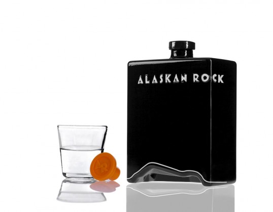
I thought this was AWSOME, The played on the word rock and the form of a mountain on the logo, they formed the glass to contour the lines and in doing so they also made a glass that looks like a geode or a miniral stone. Im not sure how I feel about the negative color scheme they used for the container package but it is overall a sleek and modern design that caught my eye.


Friday, February 8, 2013
The Dieline
The Dieline
I'm not sure how to navigate through this website exactly, but just scrolling through the updates that they offer is interesting. From already researching other websites this one seems to focus more on the modern and up-to-date designs that are either already on the shelves or very popular.


 Shelda


Wednesday, February 6, 2013
Good and Bad Packaging Design
6 Rules for Packaging Design in Retail
As we all know, there are certain things that make a product desirable among others, and, unfortunately, it is human nature to judge a book (AND product) by it's cover. Though we have often looked at common practices of what makes a GOOD package design, sometimes we need to look at some that are not as successful. The "Fabuloso" juice bottle, for example, makes it look like more of a laundry detergent design rather than something edible. Hopefully looking that these six little tips will help us in designing our next project.
-Brittany
Eat&Go
eat&go concept
Even though this is just a concept idea I find it to be quite effective and amusing. Eat&Go is a packaging designed to retract as it is used. For example when you eat a sandwich with paper wrapped around it the paper ends up getting in the way and crumbling everywhere, and in the end doesn't really protect your hands from getting the sandwich contents on your hands. So with Eat&Go the container can be pushed down like a bindy straw as you eat the sandwich. In genius. ~Shelda
Even though this is just a concept idea I find it to be quite effective and amusing. Eat&Go is a packaging designed to retract as it is used. For example when you eat a sandwich with paper wrapped around it the paper ends up getting in the way and crumbling everywhere, and in the end doesn't really protect your hands from getting the sandwich contents on your hands. So with Eat&Go the container can be pushed down like a bindy straw as you eat the sandwich. In genius. ~Shelda

Nectar Honey Beer
http://www.thedieline.com/blog/2011/10/26/nectar-honey-beer.html
I found this package design online by chance earlier this week. I think I was most struck by the way the designer used honeycomb as a starting point of his idea. If you take a look at it, you can see that the opening tab,carrying case, and can structure are even honeycomb shaped. The idea of using a simple shape to describe the majority of a concept was particularly inspiring about this package design to me.
I found this package design online by chance earlier this week. I think I was most struck by the way the designer used honeycomb as a starting point of his idea. If you take a look at it, you can see that the opening tab,carrying case, and can structure are even honeycomb shaped. The idea of using a simple shape to describe the majority of a concept was particularly inspiring about this package design to me.
Tuesday, February 5, 2013
Go for Green
Here is a website of a few package design images I thought relates to some of the folding boxes project we made last week. Just a niffty simple idea.
http://www.bookofjoe.com/2011/09/postcarden.html
On that note of green and gardens, I found this other great website of package designs for products specifically focusing around green ideas, recycling, and natural. Check this guy out...
http://www.martinazua.com/eng/design-nature/bios-urn/
See y'alls in the AM.
-Gabby

 P.S. These little guys are too cute...
The legs designed too immitate a cows utter and the folding of the paper cow also relates to our projects from last week kinda. The colors are simple and the design is small, short, and stout which makes them so cute.
http://www.bookofjoe.com/2011/09/postcarden.html
On that note of green and gardens, I found this other great website of package designs for products specifically focusing around green ideas, recycling, and natural. Check this guy out...
http://www.martinazua.com/eng/design-nature/bios-urn/
See y'alls in the AM.
-Gabby


The legs designed too immitate a cows utter and the folding of the paper cow also relates to our projects from last week kinda. The colors are simple and the design is small, short, and stout which makes them so cute.
Creative Package Design Cans
http://www.cruzine.com/2011/11/14/creative-package-designs-cans/
This site has some really cool and fun package designs of mainly cans. From vintage cans to new style cans. All kinds of ideas for are Bottles, Tubes, Tubs, and Jars project check it out.
Leo Cormier...
This site has some really cool and fun package designs of mainly cans. From vintage cans to new style cans. All kinds of ideas for are Bottles, Tubes, Tubs, and Jars project check it out.
Leo Cormier...
Sunday, February 3, 2013
Genesee Beer

Subscribe to:
Comments (Atom)